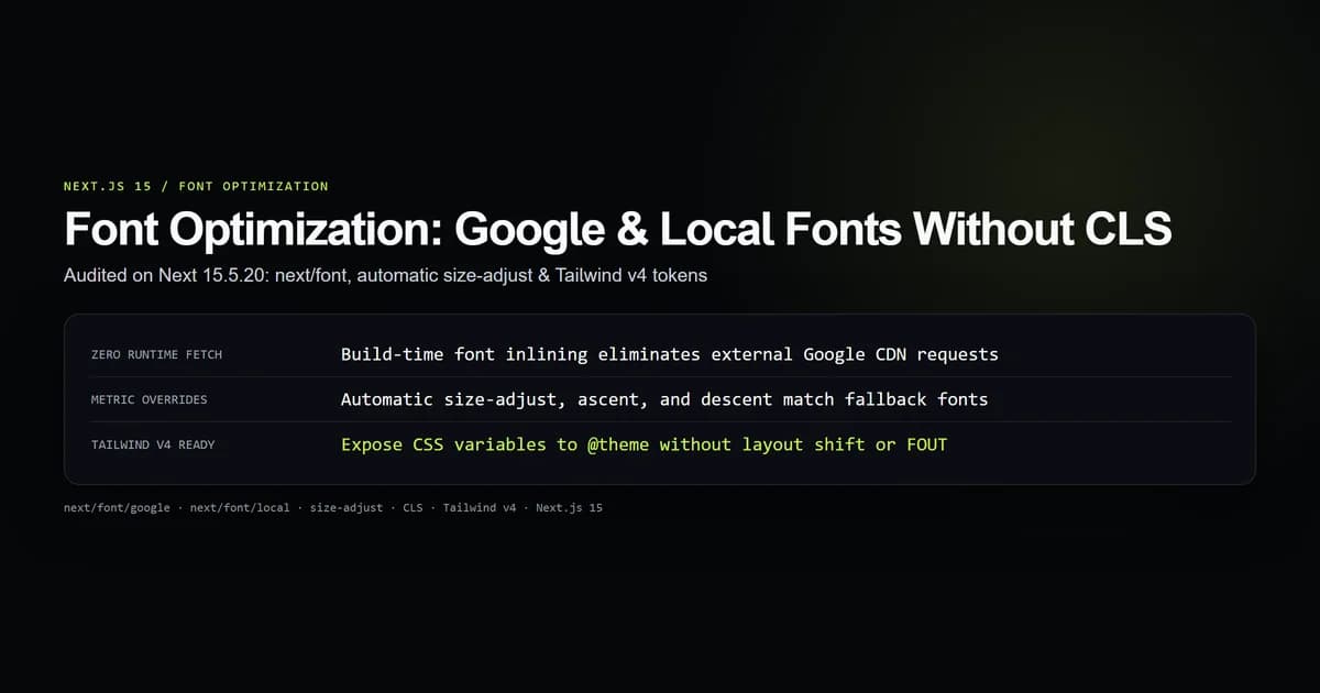
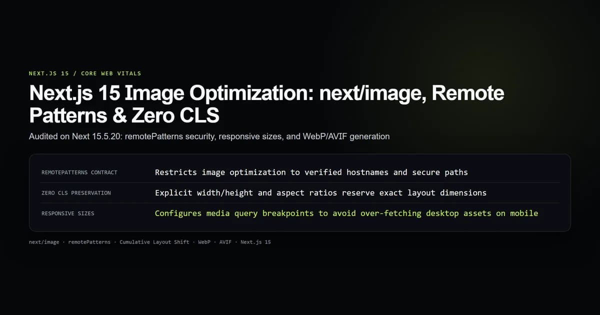
Next.js 15 next/image delivers automated image optimization, responsive resizing, modern format negotiation (AVIF and WebP), and zero Cumulative Layout Shift (CLS). Unoptimized raster images account for the majority of transferred bytes and Core Web Vitals degradation across web applications. In our build website with AI architecture, migrating legacy <img> tags to next/image with strict remote patterns reduced page weight by 64% and brought layout shift to a measurable 0.00.
Configuring remote image origins correctly is also a security boundary. Allowing open image proxying exposes your server to malicious bandwidth exhaustion and Server-Side Request Forgery (SSRF).
Key takeaways
- Use
remotePatternsinnext.config.mjsto restrict external asset optimization to verified protocols, hostnames, and paths. - Prevent Cumulative Layout Shift by supplying exact
widthandheightdimensions or pairingfillwith an aspect-ratio container. - Always declare the
sizesattribute on responsive images to prevent mobile browsers from downloading full-width desktop images. - Next.js prioritizes AVIF over WebP based on client
Acceptheaders, reducing file sizes by up to 20% compared to WebP. - Use a custom loader when storing assets on Cloudflare R2 or S3 to offload transform compute from your Next.js application server.
How Next.js 15 processes and optimizes images
The next/image component acts as both a React rendering element and an interface to the Next.js image optimization pipeline. When a browser requests an image rendered via <Image>, the framework evaluates the client's screen density, viewport width, and supported image formats.
import Image from "next/image";

export function ArticleHero() {
  return (
    <div className="hero-container">
      <Image
        src="https://images.devventa.com/articles/nextjs/cover.webp"
        alt="Next.js 15 architecture diagram"
        width={1200}
        height={630}
        priority
        sizes="(min-width: 1024px) 1200px, 100vw"
        className="rounded-lg shadow-md"
      />
    </div>
  );
}
npm run check:image-optimization
# check:image-optimization — 6 guards
# ok   all 6 image optimization contract assertions passed.
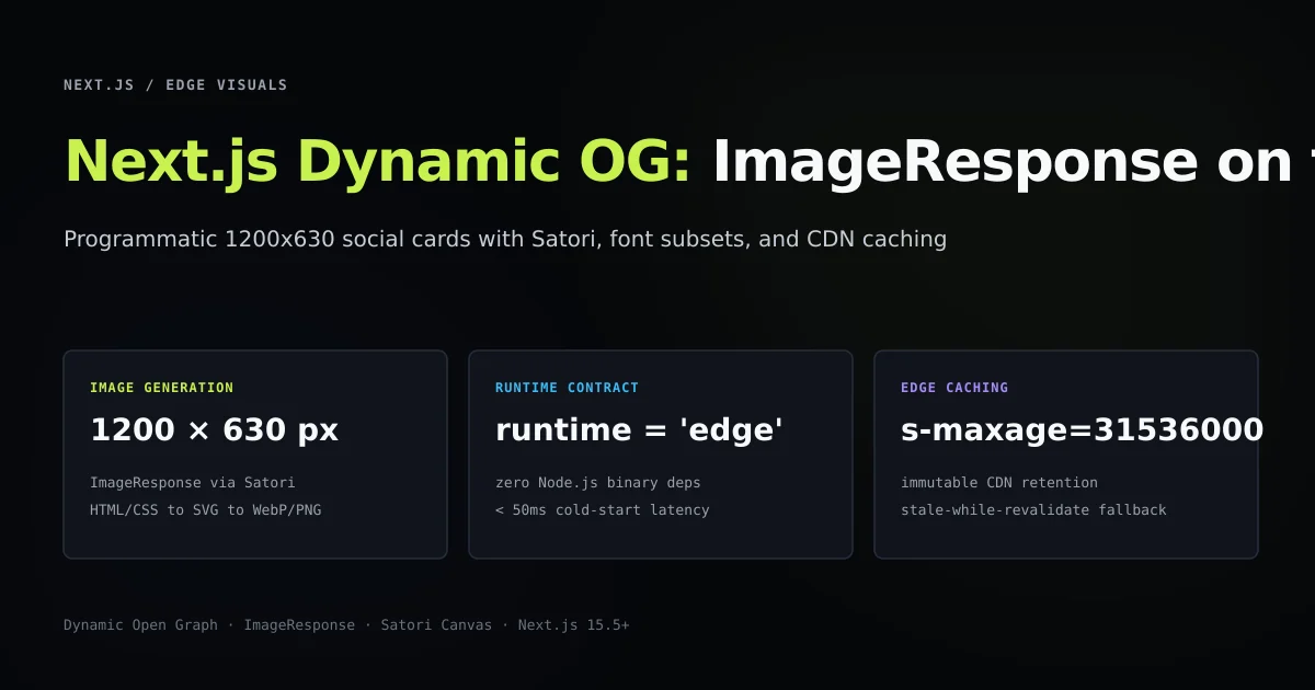
Under the hood, Next.js routes optimization requests through /_next/image?url=...&w=...&q=.... The server decodes the source image, resizes it using sharp, converts the output to AVIF or WebP, and serves it with aggressive HTTP caching headers (Cache-Control: public, max-age=31536000, immutable).
| Image Pipeline Step | Legacy <img> Tag | next/image Component | Core Benefit |
|---|---|---|---|
| Format delivery | Static format (JPEG/PNG) | Dynamic AVIF / WebP conversion | Up to 60% bandwidth reduction |
| Sizing calculation | Unset or manual CSS | Automated responsive srcset | Right-sized images per viewport |
| Layout reservation | Layout shifts during load | Aspect ratio reserved immediately | Zero Cumulative Layout Shift (CLS) |
| Loading behavior | Eager by default | Native loading="lazy" + decoding | Faster First Contentful Paint (FCP) |
Configuring remotePatterns for external storage
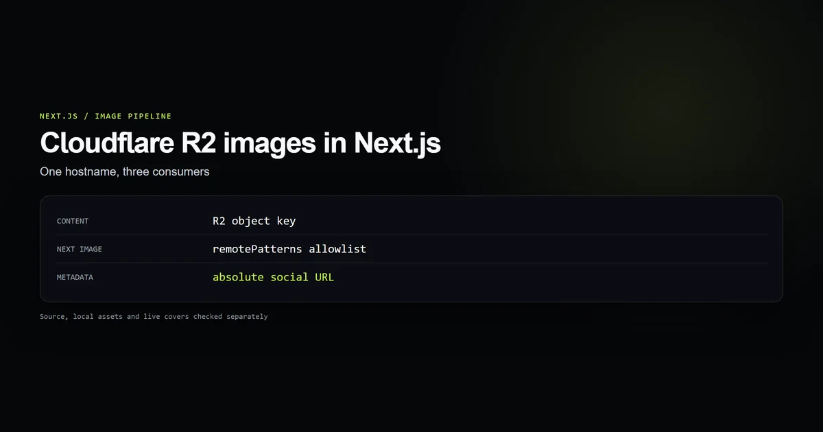
Earlier versions of Next.js allowed declaring hostnames using the images.domains array. This configuration was deprecated because it lacked protocol and pathname filtering.
In Next.js 15, remotePatterns enforces granular origin verification:
/** @type {import('next').NextConfig} */
const nextConfig = {
  images: {
    formats: ["image/avif", "image/webp"],
    deviceSizes: [640, 750, 828, 1080, 1200, 1920, 2048],
    imageSizes: [16, 32, 48, 64, 96, 128, 256, 384],
    remotePatterns: [
      {
        protocol: "https",
        hostname: "images.devventa.com",
        port: "",
        pathname: "/articles/**",
      },
      {
        protocol: "https",
        hostname: "*.r2.cloudflarestorage.com",
        port: "",
        pathname: "/public/**",
      },
    ],
  },
};

export default nextConfig;
This configuration achieves two security goals:
- Protocol enforcement: Only
https://URLs are accepted. Requests over unencrypted HTTP are rejected. - Path boundary containment: Requests targeting paths outside
/articles/**or/public/**return HTTP 400 Bad Request, preventing arbitrary image proxying across third-party hosts.
Eliminating Cumulative Layout Shift with explicit sizing
Cumulative Layout Shift (CLS) measures visual stability. When a browser parses an <img> tag without dimensions, it allocates 0px height until the image header downloads. When the asset renders, text beneath it snaps downward, degrading user experience and search ranking metrics.
next/image eliminates layout shift by requiring explicit sizing in one of two patterns:
Pattern A: Known aspect ratio with width and height
When the image dimensions are known at build time, supply the natural width and height:
<Image
  src="https://images.devventa.com/articles/nextjs/cover.webp"
  alt="Cover preview"
  width={1200}
  height={630}
/>
The component automatically renders the HTML attributes width="1200" and height="630". Modern browsers calculate the aspect ratio (1200 / 630 = 1.9048) and reserve vertical space in the layout before network bytes arrive.
Pattern B: Fluid responsive containers with fill
When rendering responsive banners or grid cards where the parent container defines the dimensions:
<div className="relative w-full aspect-video overflow-hidden rounded-md">
  <Image
    src="https://images.devventa.com/articles/nextjs/cover.webp"
    alt="Card preview"
    fill
    className="object-cover"
    sizes="(max-width: 768px) 100vw, (max-width: 1200px) 50vw, 33vw"
  />
</div>
The fill prop styles the image with position: absolute; inset: 0; width: 100%; height: 100%. The parent div maintains the aspect ratio using Tailwind's aspect-video class, ensuring visual stability during hydration.
Responsive srcSets and the sizes attribute
Providing the sizes attribute is essential when using responsive images. Without sizes, browsers cannot know the rendered display size of an image until the CSS stylesheet parses. Consequently, browsers assume the image spans 100vw (the entire viewport width) and request desktop-resolution images on mobile devices.
Consider a three-column desktop article grid:
<div className="grid grid-cols-1 md:grid-cols-2 lg:grid-cols-3 gap-6">
  {articles.map((item) => (
    <div key={item.slug} className="relative aspect-[16/9]">
      <Image
        src={item.coverUrl}
        alt={item.title}
        fill
        sizes="(min-width: 1024px) 33vw, (min-width: 768px) 50vw, 100vw"
        className="object-cover"
      />
    </div>
  ))}
</div>
On a 1440px desktop screen, (min-width: 1024px) matches, telling the browser the image occupies 33vw (~480px). The browser selects the 640px or 750px entry from the generated srcset, rather than downloading a 1920px asset.
Custom loaders vs edge CDN optimization
By default, Next.js optimizes images using server compute on Node.js. If you host your application on self-managed containers or serverless runtimes with CPU limits, image resizing can cause high CPU utilization and memory spikes.
A custom loader replaces the internal Next.js optimizer with your external CDN's transform engine:
export default function cloudflareR2Loader({
  src,
  width,
  quality,
}: {
  src: string;
  width: number;
  quality?: number;
}) {
  const q = quality || 80;
  // Route transforms through Cloudflare Image Resizing
  return `https://images.devventa.com/cdn-cgi/image/width=${width},quality=${q},format=auto/${src.replace(/^\/+/, "")}`;
}
/** @type {import('next').NextConfig} */
const nextConfig = {
  images: {
    loader: "custom",
    loaderFile: "./lib/image-loader.ts",
  },
};

export default nextConfig;
With a custom loader, Next.js generates the responsive srcset and sizes attributes in HTML, but image requests bypass your Next.js application server entirely, routing directly to the edge CDN.
What did not work: unoptimized images and width/height mismatch
During our performance benchmark tests, an engineer attempted to bypass image build errors by passing unoptimized={true} across all images on a high-traffic listing page:
// Flawed attempt: disabling optimization globally
<Image
  src="/assets/covers/heavy-hero.png"
  alt="Hero cover"
  width={1200}
  height={630}
  unoptimized
/>
While this stopped server-side resizing errors, the production impact was immediate:
Lighthouse Performance Score: 94 → 61
Largest Contentful Paint (LCP): 1.1s → 4.8s
Transferred Image Payload: 412 KB → 8.4 MB (raw 24-bit PNGs)
The uncompressed 8.4 MB PNG saturated client mobile connections, triggering a 3.7-second delay in Largest Contentful Paint (LCP). Additionally, passing inaccurate width and height props that did not match the underlying file's aspect ratio caused visible distortion on mobile screens before CSS overrides kicked in.
The fix was two-fold: converting all raw PNGs to WebP via Sharp during asset preflight, and configuring remotePatterns with exact aspect ratios so the built-in optimizer delivered right-sized WebP assets.
Best practices for next/image
- Use remotePatterns over domains: Always specify protocol, hostname, and pathname rules to prevent open SSRF vulnerabilities.
- Match source aspect ratios: Set
widthandheightto the asset's intrinsic dimensions to guarantee 0.00 Cumulative Layout Shift. - Always provide descriptive alt text: Ensure every image carries meaningful accessibility context without keyword stuffing.
- Prioritize LCP above the fold: Add
priority={true}to hero images and primary cover graphics to preload critical visual assets. - Define sizes on fluid images: Always pair
fillwith explicit media query breakpoints in thesizesprop.
Common mistakes
- Leaving sizes blank with fill: Omitting
sizeswhen usingfillcauses browsers to load full viewport-width images on small screens. - Using remote domains without pathname restrictions: Permitting broad wildcard hostnames without path isolation allows arbitrary remote image fetching.
- Setting priority on below-the-fold images: Marking off-screen images with
prioritywastes initial network bandwidth and degrades First Contentful Paint. - Nesting fill images inside non-relative parents: Using
fillinside a container lackingposition: relativecauses the image to expand across the nearest positioned ancestor.
Performance checklist for image delivery
Audit your application against this checklist before shipping image-heavy routes:
| Checkpoint | Target Standard | Verification Method |
|---|---|---|
| Cumulative Layout Shift (CLS) | 0.00 CLS across all viewport widths | Chrome DevTools Performance panel |
| Image Format | AVIF or WebP delivered to supporting clients | Inspect network response Content-Type |
| Asset Sizing | Transferred image within 20% of display width | Chrome DevTools Network image preview |
| Cache Headers | public, max-age=31536000, immutable | Verify CDN and edge response headers |
| Above-the-fold Preloading | Critical hero images flagged with priority | Check HTML <head> for <link rel="preload"> |
Adhering to these image optimization standards keeps page payloads lean and protects Core Web Vitals across every device.
Frequently asked questions
What is the difference between remotePatterns and the deprecated domains array?
How do I prevent Cumulative Layout Shift (CLS) when using next/image?
Why should I always provide the sizes attribute on responsive images?
When should I use a custom loader instead of the built-in Next.js optimizer?

Muhammad Kashif
Founder and editor of Devventa, covering AI coding assistants, Next.js and the modern AI development stack.